
01 Project Overview
Jedify is AI-powered startup, analytics platform that lets teams explore, and understand their business data through natural language conversations - no SQL required. Think of it as a data analyst in your pocket, powered by a semantic layer that understands your business context.
The main Goal
Evolving visual language, usability patterns, and design system foundations to better support scale and consistency across the B2B startup
02 The Problem
Startup is moving fast the naturaly the design system was scattered - we had 47 distinct button implementations. Not variants — separate components, each with their own logic.
03 The Audit
Before designing anything new, we inventoried everything that existed - screenshotting every screen, tagging every component, and tracing every value back to its origin. The audit surfaced 47 button implementations, 14 shades of the same indigo-violet, 6 competing font families.
47
Button implementations
Ranging from sharp corners to fully rounded pills - separate components, not variants
14
Shades of indigo-violet
All meant to be "the primary color" - none agreed on the exact hex
6
Different Font Sizes
Inter family
04 Solution
Buttons
Before — button chaos
Run query
Export
+ Add insight
Verify
Cancel
View history
Submit
7 of 47 button styles found across the product
After — 3 intentional variants
Run query
+ Add insight
Export
View history
Cancel
Dismiss
Primary · Secondary · Tertiary — with full state coverage
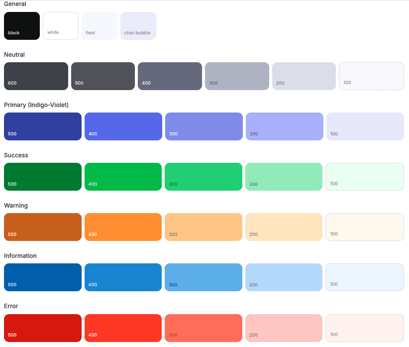
Colors

Typography
Urbanist
H1
32px
H2
24px
H3
18px
Paragraph
16px
Smaller text
12px
Componants example:

